The Physics of Pigment: Why Studio Lighting Redefines Your Palette


In high-fashion photography, color is not a static choice. It is a dynamic interaction between fabric, pigment, and the specific wavelength of the light source. While natural light fluctuates in temperature and intensity throughout the day, a controlled studio environment utilizing professional strobes calibrated to 5600K—the standard for daylight balanced flash—provides a consistent and predictable canvas. Understanding the physics of how these lights interact with different hues is essential for selecting the best colors for maternity photos that achieve an editorial, maximalist finish.
The Technical Standard: The Impact of 5600K Lighting
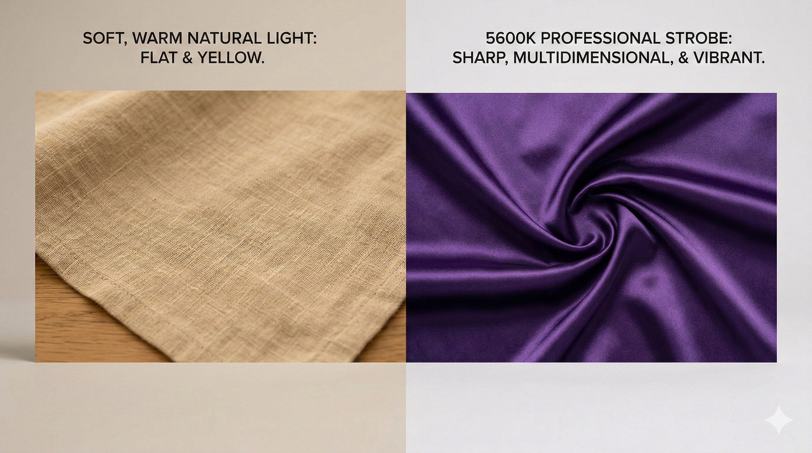
The color temperature of a light source is measured in Kelvin. Natural light can range from the "blue hour" of 10,000K to the orange "golden hour" of 2,000K. This inconsistency makes true color representation difficult. Professional studio strobes are engineered to emit light at a precise 5600K, which is the technical equivalent of high noon sunlight.
Color Accuracy and Saturation
When a pigment is hit by a 5600K flash, it reveals its truest form. This is why "Expert Narratives" in fashion often favor deep, saturated pigments over muted, organic tones. Under the surgical precision of a strobe, a deep emerald green or a vibrant ruby red does not just look "dark." It reveals a spectrum of micro-tones and highlights that natural light simply cannot penetrate. For a subject aiming for a "Royal" or "Editorial Boss" persona, these high-saturation colors provide the necessary visual weight to ground a maximalist composition.
The Problem with "Natural" Neutrals
The "natural light" era popularized "sad beige" and earthy neutrals, but these colors often fail in a technical studio setting. Under high-powered strobes, very light neutrals can lose their definition and appear washed out or "muddy" if the lighting is not perfectly sculpted. To avoid a flat result, professional direction favors colors with structural integrity—pigments that have enough depth to hold a shadow.
The Interaction of Texture and Light
Physics dictates that light interacts differently with various surface textures. In a luxury session, the choice of fabric is just as important as the choice of color.
Reflective vs. Absorptive Surfaces
Materials like silk, satin, and sequins are highly reflective. When hit by a professional strobe, they create "specular highlights"—those bright, sharp points of light that give an image a three-dimensional, high-fashion feel. A deep sapphire silk gown under a rim light will show a brilliant, electric blue edge where the light grazes the fabric.
Conversely, absorptive fabrics like velvet or heavy wool create deep, rich shadows. These materials are excellent for the "Architecture of Curves" because they allow the photographer to use light to "carve" the silhouette. The best colors for maternity photos in these textures are often jewel tones, as they provide enough pigment to remain vibrant even in the deepest shadows.
Archetypal Color Theory: Mapping Persona to Palette
In an editorial context, color is used to communicate a specific archetype. This strategic use of color theory ensures the final portrait is more than a photograph; it is an iconic representation of a specific mood.
- The Royal: This persona utilizes gold, deep violet, and regal crimsons. These colors interact with strobe light to suggest power and permanence.
- The Ice Queen: This aesthetic relies on silver, cool blues, and stark whites. Technical lighting is used here to create a high-key, ethereal glow that feels fine-art and avant-garde.
- The Fashionista: This archetype embraces trend-driven palettes, such as electric pinks, acid greens, or deep monochrome blacks. The goal is a sharp, high-contrast look that mimics a luxury brand campaign.

The Role of Contrast and the Cyclorama
The background is the final element in the physics of pigment. A professional studio often utilizes a cyclorama wall or high-end seamless paper to create a "limitless" environment. The interaction between the gown color and the background color determines the visual impact.
Monochromatic vs. Complementary Schemes
A monochromatic approach—such as a ruby gown against a deep red background—creates a sophisticated, textural image where the subject is defined solely by the shadows created by the strobes. A complementary scheme—such as a gold gown against a deep navy backdrop—uses color physics to make the subject "pop" forward in the frame. This technical decision is made during the priming phase to ensure the final result meets the editorial standard of the project.
Conclusion: A Scientific Approach to Style
Selecting the best colors for maternity photos is a scientific process as much as it is an aesthetic one. By understanding how 5600K strobe light interacts with specific pigments and textures, one can move beyond the limitations of "lifestyle" photography. The result is a high-definition, maximalist portrait where every hue is intentional, every highlight is sharp, and the final image stands as a masterpiece of professional artistry.