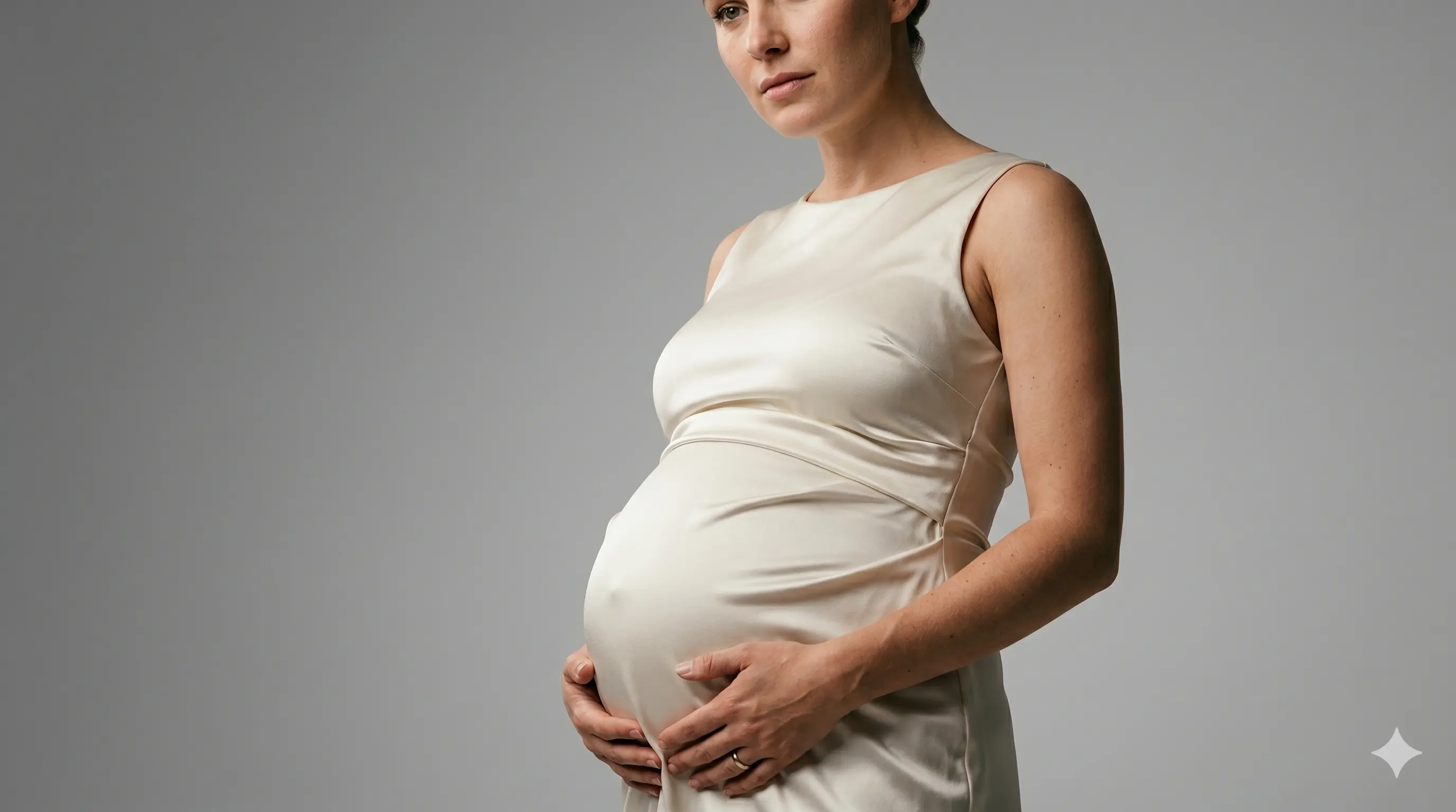
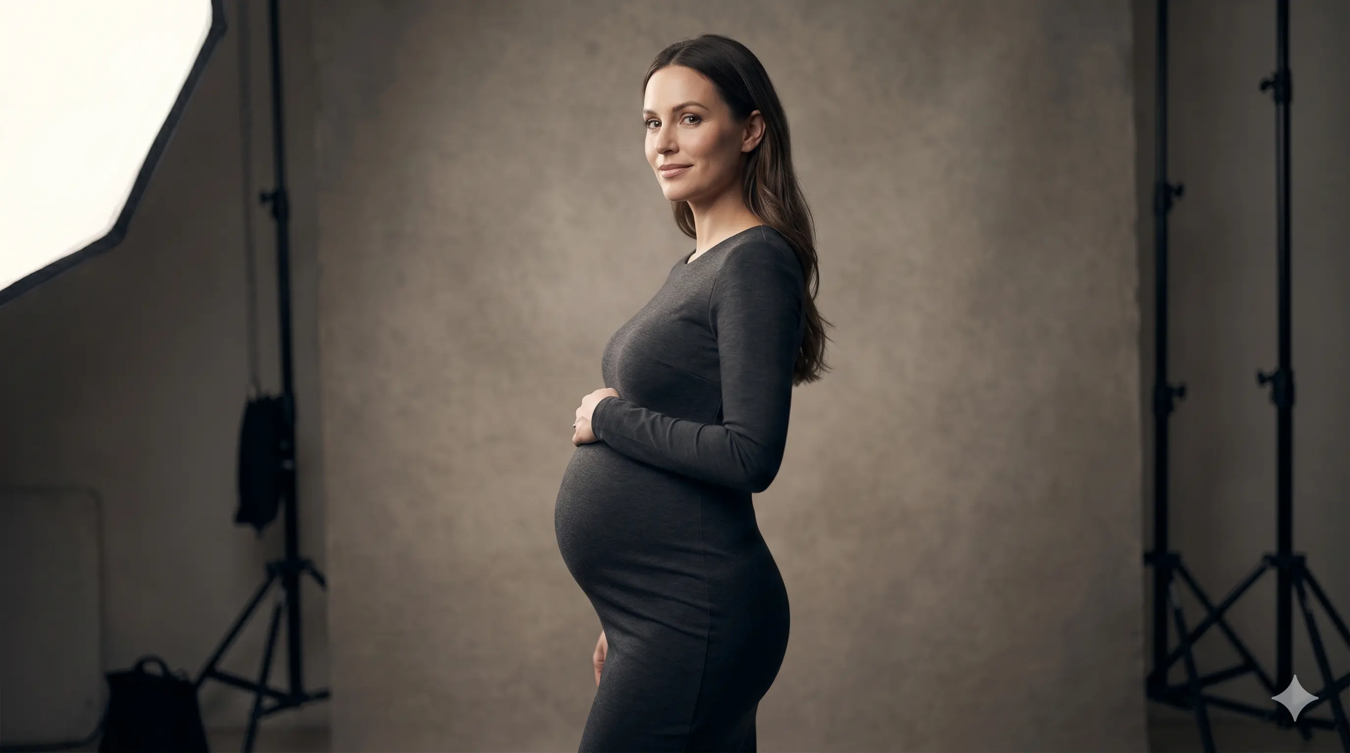
Maternity Photoshoot Posing Guide (From Awkward to Editorial)


The most common thing clients say when they book a maternity session is some version of: "I have no idea how to pose." Sometimes it comes out as a joke. Sometimes it's a genuine source of anxiety. Either way, it's the thing sitting in the back of their mind when they walk through the studio door.
Here's what I tell every client before we start: you don't need to know how to pose. That's my job. What helps is understanding what we're doing and why — so instead of waiting to be placed like a mannequin, you can feel the direction and move with it.
That principle shapes everything in this guide. Good maternity posing isn't a catalogue of positions to memorize. It's a set of relationships — between the body, the light, the fabric, and the camera — that, when you understand them, make every adjustment feel logical rather than arbitrary.
Posing Is About Shape, Not Position
The word "pose" implies something fixed. A stance. A position you hold until the shutter fires. In reality, the best maternity images almost never come from a pose that was locked in and held — they come from a moment of refinement, a small shift, a direction that landed just right.
What posing is actually about in a studio context is shape: how the body reads as a two-dimensional silhouette inside the frame, and how light is interacting with its angles and curves. Two people can stand in identical positions and look completely different depending on where the light is coming from, how their weight is distributed, and what their arms are doing.
Once you understand that, posing stops being about replicating a reference image and starts being about reading the body in real time and making adjustments that serve the specific person in front of you.
Start at the Floor: Foot and Hip Position
Most posing guides start at the face or the hands — the things closest to the lens. I start at the floor, because the base of the pose determines everything above it.
When both feet are planted at the same width and carrying equal weight, the hips lock into a level, symmetrical position. That symmetry reads as static in a photograph. It flattens the body and removes the natural S-curve that makes a silhouette interesting.

The fix is simple: shift the weight. Have the client transfer most of their weight onto one leg, letting the opposite hip drop slightly and the knee soften. That single adjustment changes the entire geometry of the pose. The hip on the weighted side rises, creating a curve. The shoulder on the opposite side often drops to compensate, introducing a diagonal line through the body. The bump, rather than sitting flat in the center of the frame, angles slightly — which makes it read as more prominent and three-dimensional.
Everything else in the pose — where the arms go, how the shoulders sit, what the hands are doing — is built on top of this foundation. Get the feet and hips right first, and the rest of the adjustments are small.
Turn the Body: Why Straight-On Rarely Works
After foot placement, the next most important adjustment is the angle of the body relative to the camera.
Standing square — both shoulders facing the lens, body oriented directly forward — is the most natural thing to do when someone points a camera at you. It's also almost always the least flattering option in a maternity portrait.
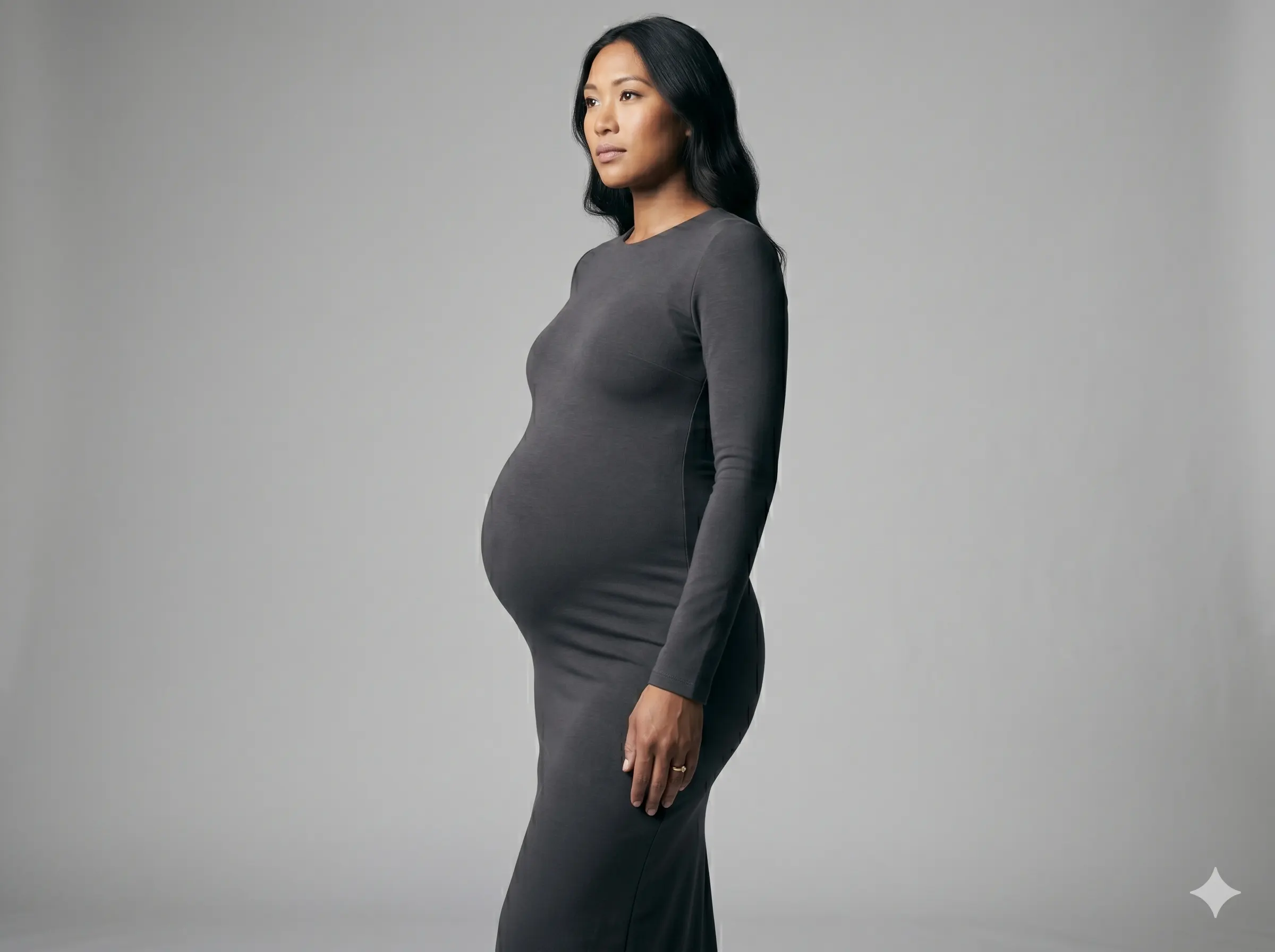
The problem is geometry. A straight-on stance gives the camera the widest possible view of the torso. It removes depth from the frame. It flattens the silhouette. And it tends to make the bump look wide rather than round — which is the opposite of what most clients want.
A rotation of 30 to 45 degrees solves most of this in one move. The body gains depth. The bump projects forward rather than spreading sideways. The waist, even in late pregnancy, becomes more defined because the camera is now seeing it at an angle rather than head-on. And the silhouette — that profile line from shoulder to hip to thigh — becomes something the light can actually sculpt.
The exact angle depends on the client and the lighting setup, but as a starting point, a three-quarter turn is almost always more interesting than straight-on.
Arms and the Space Around the Body
Arm placement is one of the most overlooked elements of maternity posing, and one of the easiest to get wrong.
When arms press flat against the sides of the body, they merge visually with the torso. The waist disappears. The silhouette widens. The image feels compressed in a way that's hard to articulate but immediately noticeable.

The solution is space — a small gap between the inner arm and the side of the body. It doesn't need to be dramatic. Even a few centimeters of separation is enough to restore the waist line, clean up the silhouette, and give the image a sense of openness.
What the hands do within that space matters too. In maternity photography, hands naturally gravitate toward the bump — which is exactly right, because they direct the viewer's eye to the focal point of the image. One hand under the bump and one above is a classic placement for good reason: it frames the bump, reinforces its shape, and feels genuinely tender rather than staged. Variations — both hands gently cupping from the sides, one hand on the waist with the other resting on top — work well depending on the wardrobe and the mood you're going for.
What to avoid: hands that are stiff, splayed, or gripping too hard. Tension in the hands travels up the arms and into the shoulders. Soft hands almost always mean a softer, more natural image overall.
The Chin, the Neck, and What They Do to an Image
A small adjustment at the very top of the pose can change the entire feeling of an image, and it's one that clients rarely think about.
A slightly extended chin — not pushed dramatically forward, but gently lifted and extended — does several things at once. It lengthens the neck, which reads as elegant. It separates the jawline from the collarbone, reducing the visual compression that happens when the chin drops. And it improves posture in a way that the client can feel, which often relaxes the rest of the body.

The direction I give is usually something like: "bring your chin slightly forward and down, like you're trying to lengthen the back of your neck." It sounds counterintuitive, but that combination — chin out rather than up — avoids the slightly confrontational look that a lifted chin can produce, while still getting the separation and length you're after.
Paired with relaxed shoulders (which is its own ongoing direction throughout a session), the upper body falls into alignment in a way that makes everything from the lighting to the fabric behave better.
How Lighting and Posing Work Together
Posing and lighting aren't separate decisions — they're in constant conversation with each other.
The same pose can look dramatically different depending on where the light is placed. Directional light from the side will emphasize the curves created by a weight shift and a body turn; it rewards the three-dimensionality that good posing creates. Flat frontal lighting will flatten all of it back out, regardless of how well the body is positioned.
This is one reason why posing adjustments that work beautifully in one lighting setup can fall flat in another. In a studio, the light is fixed — so the posing has to be built around it. When I'm directing a client into position, I'm watching not just how the pose looks from my angle, but how the light is landing on the body. Where are the shadows falling? Is the bump catching enough light to read clearly? Is the face in a flattering relationship to the source?
Posing and light together is where the image is actually made. Either one alone is only half of it.
For a deeper look at how lighting direction affects the way the body reads on camera, this guide walks through the technical side of studio maternity lighting.
Movement Over Stillness
One of the fastest ways to break tension in a session — in the client and in the image — is to introduce movement.
Not dramatic movement. Not walking across the room or spinning. Just micro-adjustments: shifting weight from one foot to the other, softly repositioning the hands, a gentle turn of the shoulders. These small motions keep the body from locking up, and they create natural transition moments that are often far more interesting to photograph than a held position.
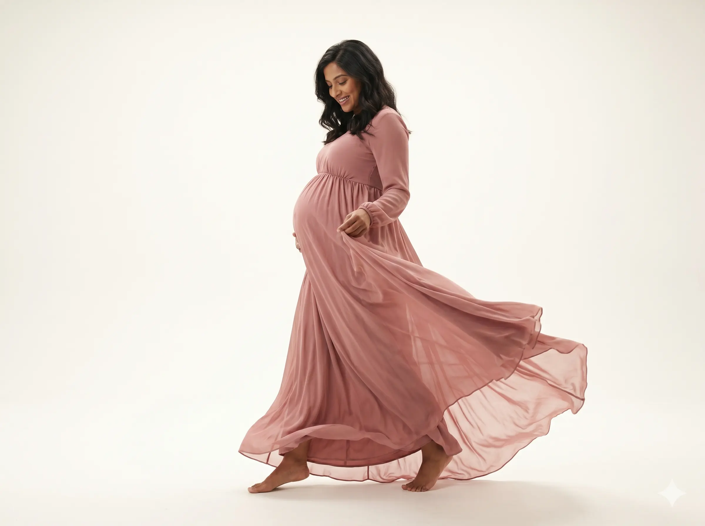
The practical approach is to give a direction, let the client settle into it, and then continue talking and adjusting rather than going silent while you shoot. Silence tends to make people freeze. A steady stream of direction — "good, now just soften that front knee slightly, and let your hands relax" — keeps the body in motion and the energy in the room alive.
Some of the best frames from any session come from the half-second between one direction and the next.
When the Outfit Changes the Pose
Wardrobe and posing aren't independent decisions, and it's worth understanding how different garments ask for different approaches.
A structured, fitted gown rewards clean geometric posing — clear lines, deliberate angles, stillness that lets the fabric do its job. It's an outfit that wants precision, and the posing should match.
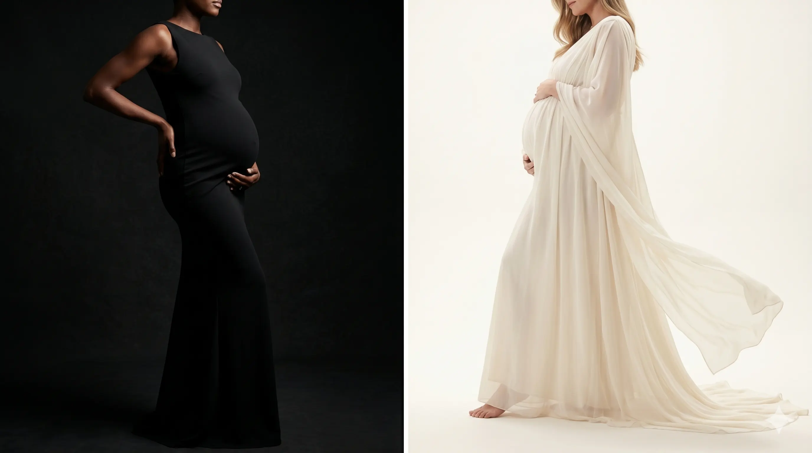
A flowing chiffon dress or a fabric with significant drape and movement behaves differently. It benefits from poses that invite the fabric to participate — a slight lean, a turn that sends the train into motion, a hand position that lifts and releases the skirt. The pose isn't just about the body anymore; it's about how the body and the fabric are working together in the frame.
Getting this relationship right makes a significant difference in how the final image reads. This guide on maternity session wardrobe covers the styling considerations in more detail.
What "Editorial" Actually Means in Posing
Editorial posing gets used as a catch-all term for images that look high-end or fashion-forward, but the underlying principle is simpler than the word implies.
An editorial pose is one where every element of the frame looks like it was placed there intentionally. The angle of the body. Where the hands are. The line of the arm. The direction of the gaze. None of it looks accidental, and none of it looks like the client was just standing there waiting to be photographed.
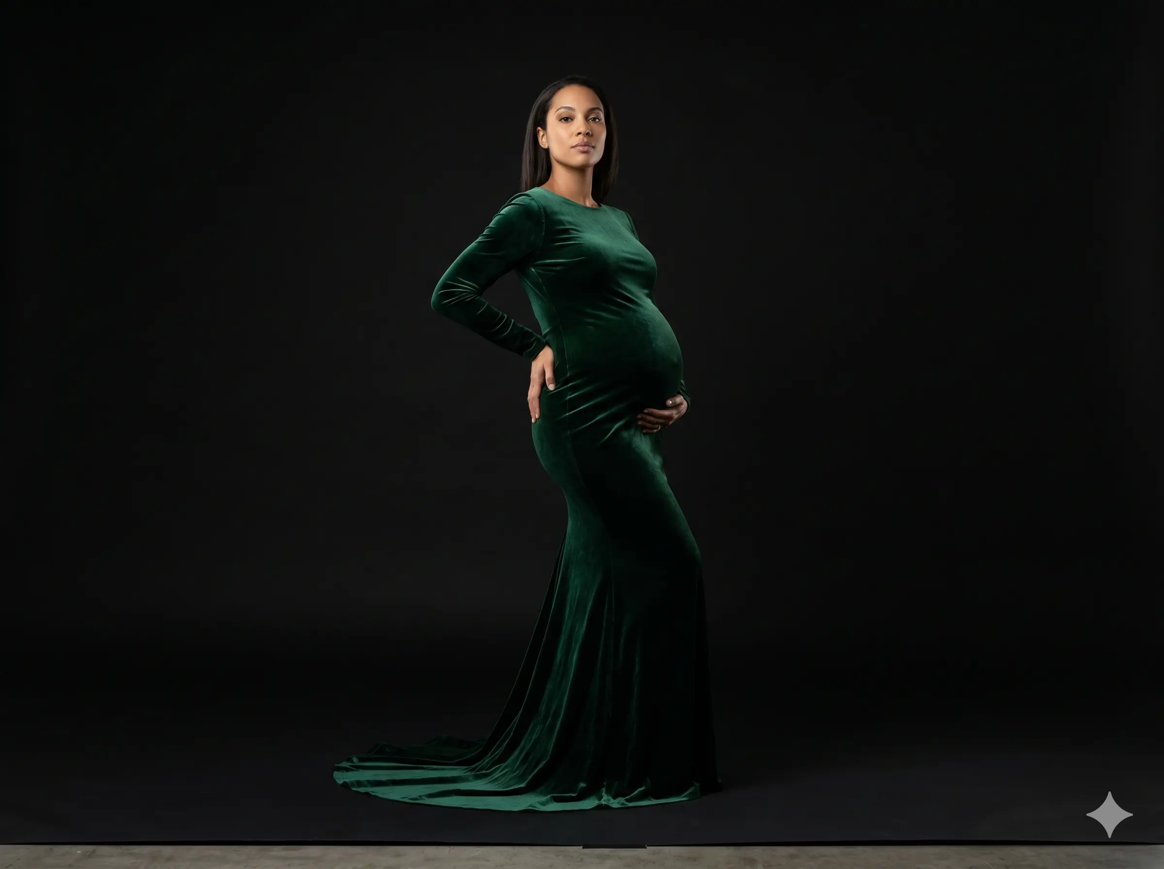
That quality — intentionality — is achievable without complexity. The most editorial-looking maternity portraits are often built on the simplest foundations: a strong weight shift, a deliberate body angle, clean arm lines, and precise light. The sophistication comes from the refinement of those basics, not from layering on more and more elements.
When the posing is right, you stop noticing it. The image just looks considered — like something that couldn't have been made any other way.
For more on how studio lighting shapes the maternity silhouette, see the full technical lighting guide here. For wardrobe guidance that connects directly to posing decisions, visit the complete maternity outfit guide.